Hey
Since you're here, you probably know I design software. On this page you can see some of my works. Only the good ones, of course. I'm too shrewd to let you know the bad ones exist. You can also read a bit about me, if you want to get a glimpse of what kind of person I am. I know it's not the most captivating read, so I supplemented it with an image of an adorable cat to improve your user experience.
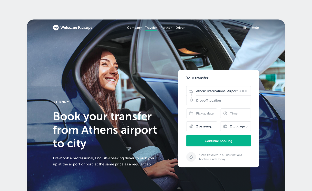
Welcome Pickups. Booking.
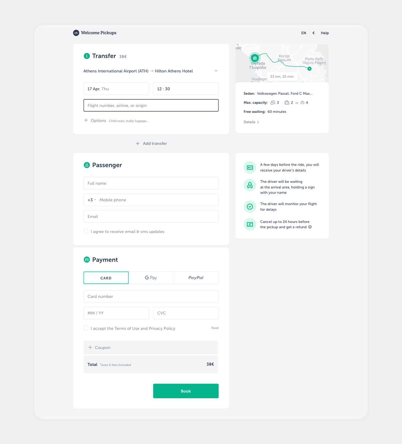
Welcome Pickups is a taxi service for travelers that handles 1500 rides a day across 50 destinations. To increase revenue, I was making continuous data-driven improvements to its booking site, which was the main source of customers. After around 20 experiments and a complete redesign, the conversion rate and revenue increased by a double-digit percentage, while support costs dropped by a similar amount. A key factor in these results was close collaboration with product managers, developers, and support agents to identify problems, develop ideas, run experiments, and ultimately deliver the final product. Design process...
— Context The main source of revenue for Welcome Pickups was ride bookings made through its website, typically for rides from the local airport to a hotel somewhere in the city. One of the main business goals was increasing that revenue. The primary way the product team could achieve this was by increasing the conversion rate from landing on the site to a paid booking.
There were serious restrictions: the site was a critical part of the business, the code was very complex, and the team had limited resources. This meant we had to be very careful, prioritize changes well, and introduce them incrementally.
— Research To identify problems that could prevent users from completing their booking, I began analyzing the data we already had: form statistics, click maps, and session recordings. This revealed several issues: high drop-off rates on certain fields, attempts to submit incomplete data, clicks on unclickable elements, and the lack of attention toward blocks that were considered important.
Next, I conducted a short series of tests with people similar to our typical bookers. They uncovered usability issues on mobile devices, a lack of adaptation for non-EU users (currency, time), problems with selecting pickup times and editing information from previous steps, along with a bunch of other issues and observations.
Initially, this provided enough information to start cooking up fixes. As this was a long-term initiative, I later used additional research methods to uncover more issues and cross-check the existing ones. These included competitor research, surveys, a fake support chat, analyzing customer reviews and support tickets, and interviewing our support agents.
— Solutions All identified problems and potential solutions were compiled into a table, which I shared with the product team to gather feedback and generate more ideas. Together with the main stakeholders, we brainstormed and prioritized the items based on potential impact, confidence, and complexity. This table became the key resource guiding our roadmap for this initiative.
There were 3 main lines of work: improving basic usability, reducing friction, and informing the booker.
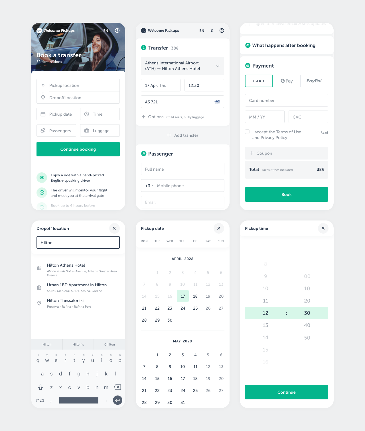
I started with basic usability, as it was the simplest and highest-confidence area. I ensured the interactive elements were large enough to tap, the correct mobile keyboards were triggered for each field, the dropdown elements were displayed within the viewport, the Back button was handled predictably, etc.
Reducing friction involved two approaches. First, I set smart defaults for fields where I had high confidence about what the booker would choose. From analyzing the stats I knew that most bookings were for two adults with two large pieces of luggage, from the local airport, and so forth. The second approach was adding tools to help bookers with the fields where they were struggling. I added a flight finder, a pickup time assistant, a better calendar, mobile payment methods, and a number of smaller tools.
The final line of work was informing the booker. I showed more important selling points, provided richer information about the ride, car, and driver, and explained what to expect after booking and upon arrival.
I quickly validated most of the changes with users via high-fidelity prototypes before handing them off to developers. Once implemented, we launched them through A/B tests and used the results to determine the next steps.
— Results A good percentage of the experiments were successful, leading to a double-digit increase in the overall conversion rate and revenue, while support costs dropped by a similar percentage. Besides the tactical improvements, I also refreshed and simplified the UI as a whole.
See the old version. The final version is below.
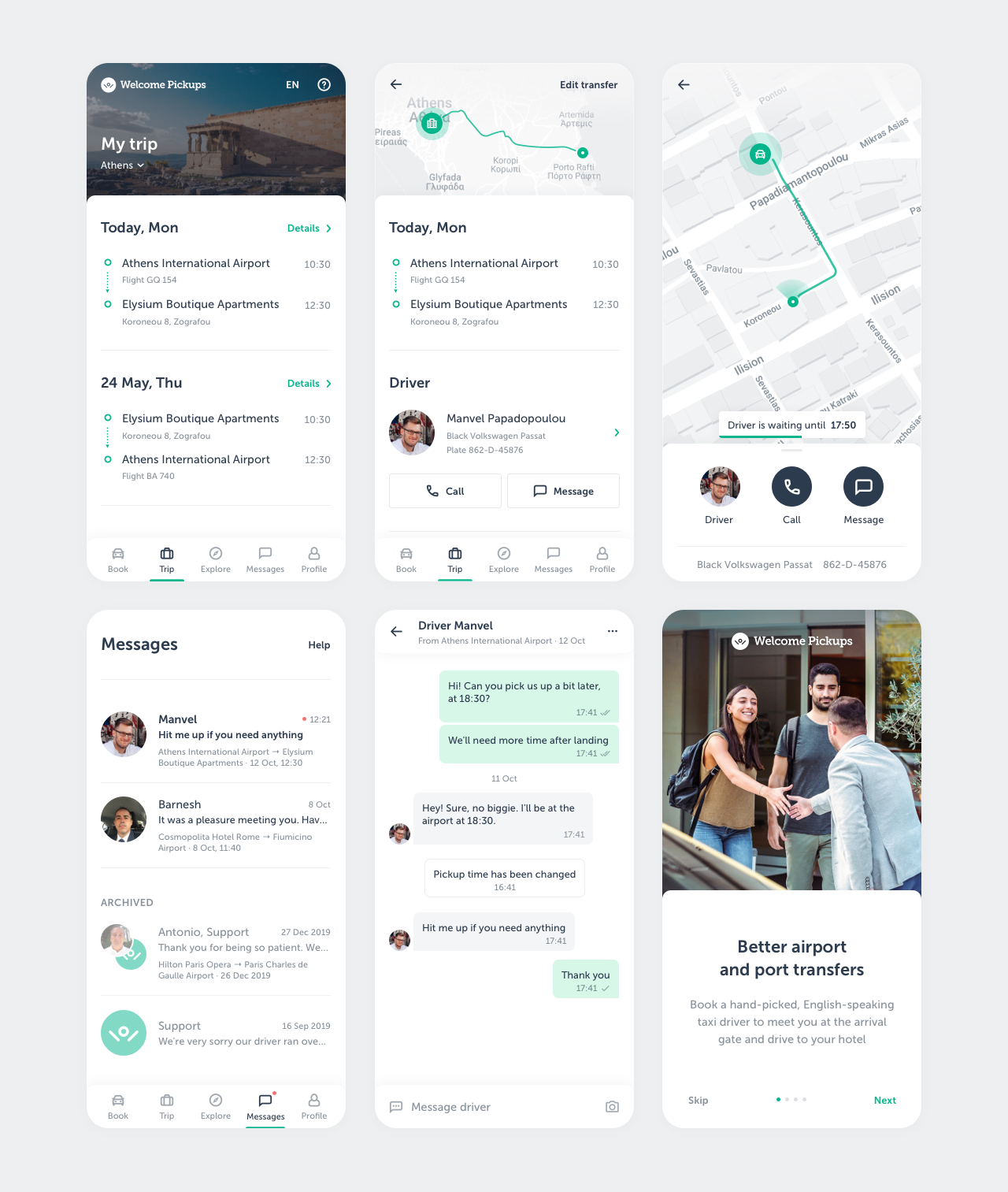
Welcome Pickups. Traveler app.
After travelers book a taxi ride, it's common for them to have issues at some point. At Welcome Pickups they were handled manually by support agents, which was expensive, slow, and left both sides wanting a better solution. After analyzing the most common issues, we realized that we could productize their resolution.
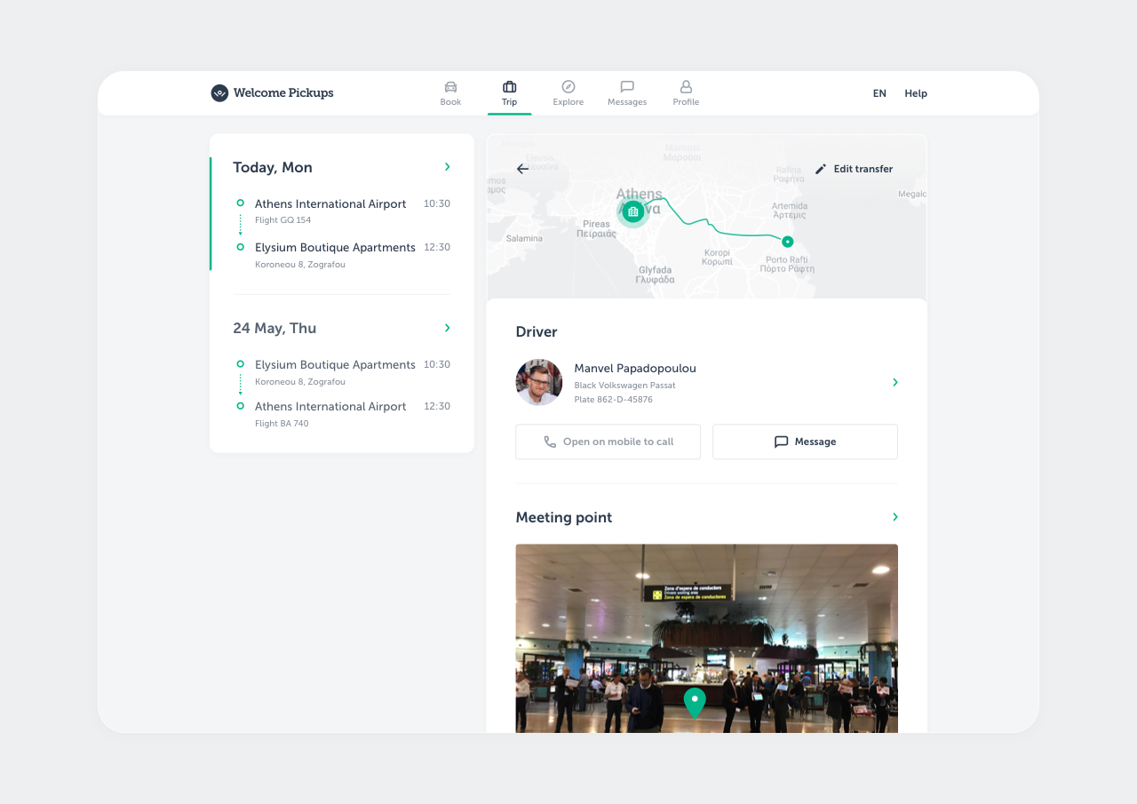
So I designed an app for riders and iteratively added features, each solving a specific problematic scenario. I worked closely with support agents and drivers to understand the problems, and with the product team to define the scope and deliver solutions efficiently. These efforts reduced the number of support tickets three-fold, improved customer satisfaction, and increased the number of returning bookers. Design process...
— Context Driving travelers around is an operationally difficult business. People cancel their trips, change booking details, get lost in unfamiliar places, flights get delayed, drivers get sick, etc.
At Welcome Pickups, the situation was especially bad due to broken communication between the company and riders. Rides were booked through a website, and riders received a series of emails with their booking and driver information. If they needed to make changes to the booking or had any other issues, they had to find the right email, contact support, and communicate with an agent via email. It was a bootstrapped solution from the early days of the company that generated a ton of expenses and friction.
To optimize costs, it was decided to enable travelers to self-service instead of going through customer support. Additionally, we thought we could improve the customer experience and get more people to book with us again.
— Research There were 3 personas involved in the book-to-ride chain: traveler, support agent, driver. To understand the problem space, I needed to see it from all 3 sides. I talked to our customer support agents and cross-checked what they said with ticket history and internal statistics. I already had some insights from the drivers because I had worked on our driver app previously. On the traveler side, we had first-hand experience since I, other team members, and their friends were Welcome riders, plus I analyzed support tickets.
This information helped identify most frequent and expensive issues, as well as their place in the ride lifecycle. Most of them revolved around not getting the emails with ride and driver details, not being able to change or cancel bookings, not having an internet connection in the destination country, and not having an easy way to find and communicate with the driver before the ride. The majority of the issues seemed solvable by riders themselves if they had an easy way to access up-to-date booking information, manage their bookings, and communicate directly with their driver. This suggested that we should build a traveler app.
The app had to be available on the web, Android, and iOS, but we had very limited resources to develop it. So we needed a cross-platform solution, and we needed to confirm if it would improve the numbers in a lean, cheap way.
— Solutions We brainstormed the top problems with the product team, came up with various solutions, assessed their viability and technical complexity, and selected a few core features that would go into the MVP. I made several interactive prototypes at different levels of fidelity, got stakeholder buy-in, quickly tested them with potential users, and eventually arrived at the final design. It was implemented, launched, and quickly gained noticeable traction.
After confirming the potential, I started adding more features to the app, which were launched one by one. The workflow at this stage was more lightweight – I already had the roadmap with all the required data and only needed to discuss the technical limitations with developers and get the UI right, which I did by stealing learning from best-in-class products. Besides automating the ride lifecycle, I worked on improving and simplifying users' travel experience overall, as well as upselling extra services.
The biggest difference was having all booking information in one easy-to-find place, keeping it up to date and reflecting any changes that happened after the booking (including when there’s no internet), allowing the rider to edit and cancel bookings, providing a map to help find the driver, and giving an easy way to call and chat with the driver.
— Results Along with the changes in the booking process, the app reduced the number of support tickets by 3X, improved customer satisfaction, and significantly increased the number of returning bookers.
Welcome Pickups. Website.
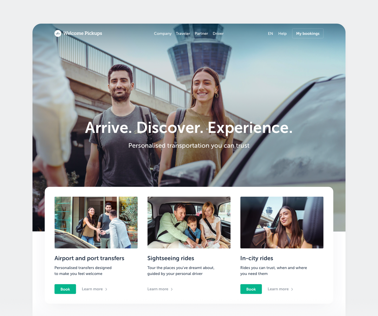
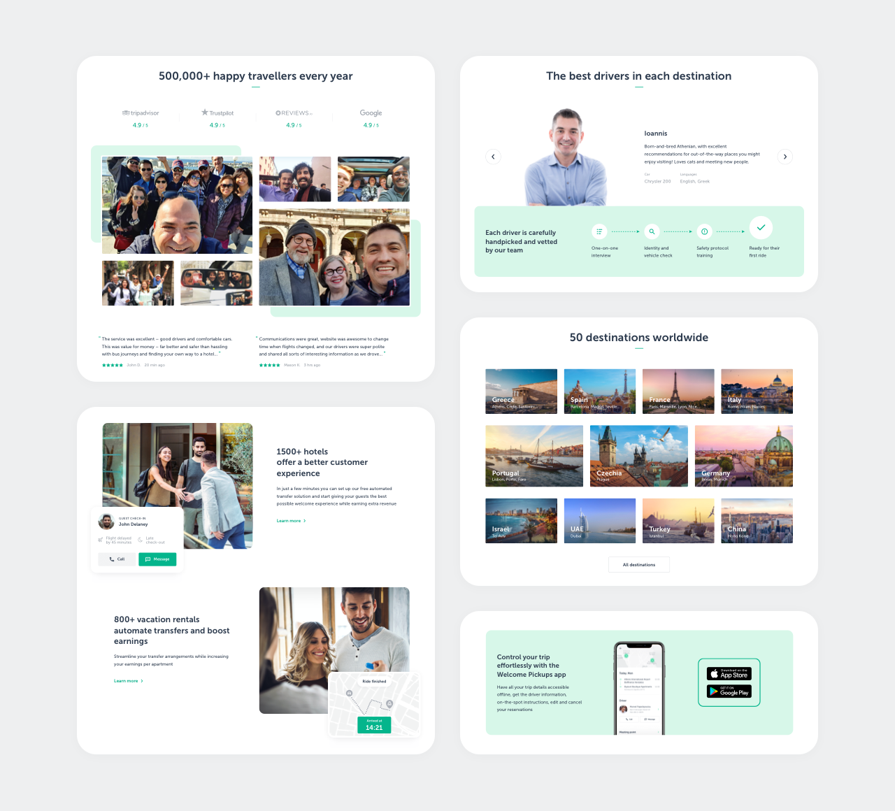
Most customers of Welcome Pickups began their journey on the website. Unfortunately, its pages were outdated, inconsistent, hard to change, and didn't represent the brand well. Preparing for a redesign, we conducted a series of A/B tests on the most visited pages to understand how changes affected conversion rates and to identify what we could and couldn't do. Once the test results were in, I designed a set of reusable building blocks and made several page templates using them.
This allowed anyone to quickly build new pages that looked fresh and consistent with the rest of the site. Additionally, I collected and organized scattered marketing resources like photos and quotes, and coordinated the creation of new ones, including bootstrapping a photoshoot.
Welcome Pickups. Dispatcher app.
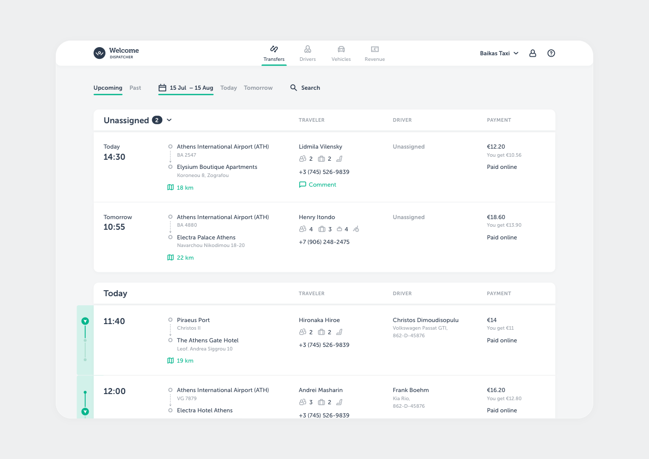
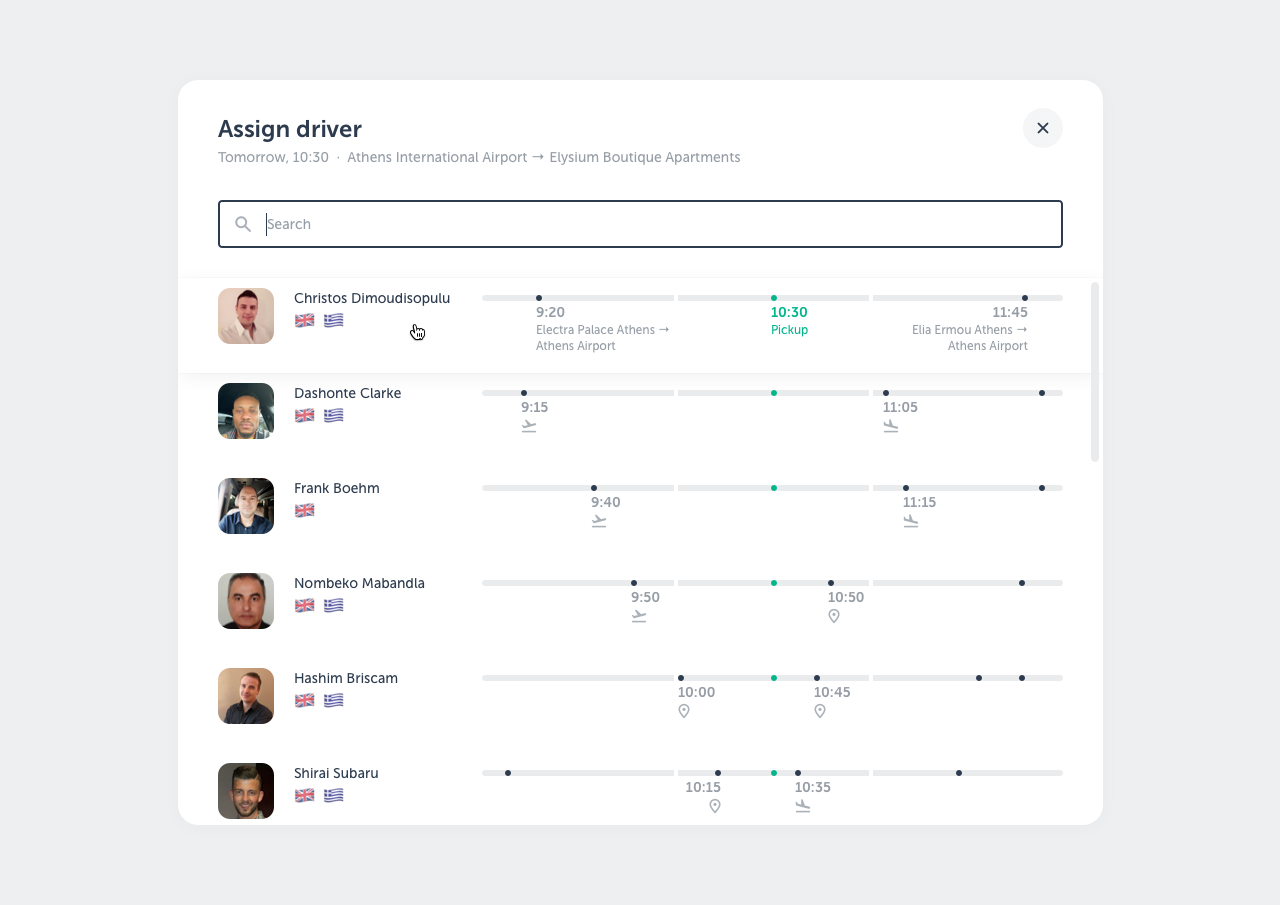
In some destinations, Welcome Pickups uses the services of local taxi fleet companies. Many of them use prehistoric tools to manage their rides and drivers, which makes communication between the two parties difficult and expensive. Additionally, this complicates the control of service quality.
It was decided to provide them with a tool that could address these issues. We interviewed several fleet managers and learned about their current workflow and tooling. Using this data, I built a web app prototype. It allows fleet managers to control the whole lifecycle of a ride, manage drivers, vehicles, and monitor revenue.
Yandex. Direct Commander app.
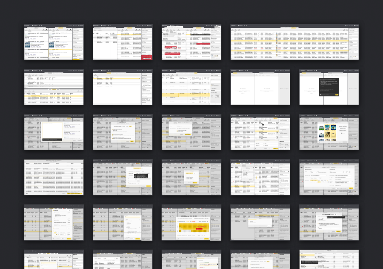
Yandex is a large tech company making billions of dollars from advertising. Big clients manage their ads using a desktop app called Direct Commander. At the time, it had serious UX issues and had gone years without a redesign. Both users and developers were frustrated with it, so I was given the opportunity to redesign it from the ground up.
Drawing on user feedback, interviews, analytics, and competitor research, I designed a series of prototypes and refined them iteratively through multiple rounds of user testing and adjustments. The final version was implemented and launched. It received great reviews, was much easier to support, and aligned better with the company’s other products. Design process...
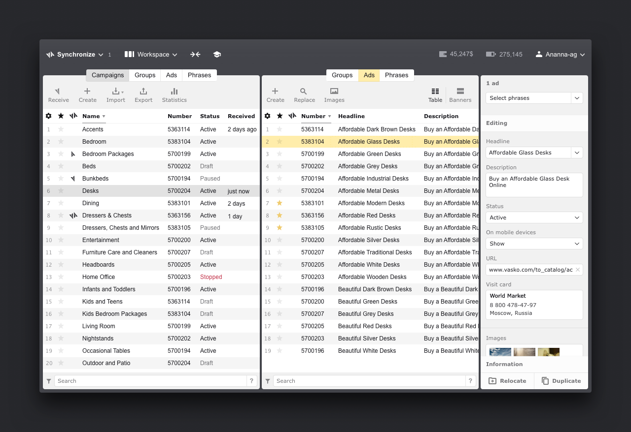
— Context Managing ads is a labor-intensive process that involves a lot of trial and error. That's why big companies hire specialists to do it. They handle hundreds of campaigns, with thousands of ads, each having about a hundred different assets and settings. This requires a way to view large amounts of information simultaneously, along with specialized tools to filter specific subsets of ads, view their contents and statistics, and perform mass actions.
Direct Commander was a tool made for these people. However, it had been designed years earlier, when advertising volumes and complexity were much lower. The team had been making iterative improvements to the app, but they didn't work well and didn't fix the fundamental flaws of its design. Users complained a lot, and at a certain point, it became clear that a full redesign was necessary.
— Research When I joined, the product owner had already conducted a lot of research. He had identified the biggest pain points from the years of user feedback, interviewed users, analyzed internal statistics to uncover usage patterns, and conducted competitor research. Together, we reviewed the list of problems, discussed potential solutions, gathered technical requirements from developers, and I began working on mockups.
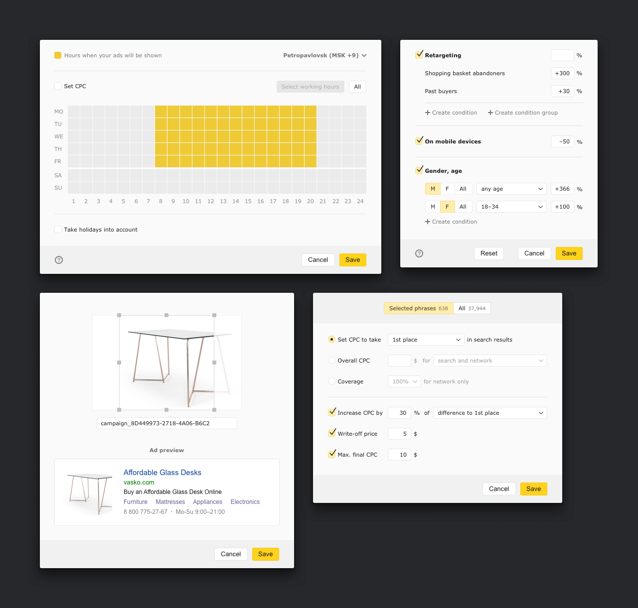
— Solutions I started with the main working area. Iterated on it with the team, moving from lower to higher fidelity assets. Eventually, I created a prototype that we tested with users and adjusted based on the issues that were found. Once the main area was done, I repeated the process with the numerous secondary tools and windows, and finally, with the combined prototype of the entire app. The product was very complex and expensive to develop, so we wanted to derisk our solution as much as possible before any code was written.
The overall focus was adapting the UI to the actual user workflows. Key changes included more compact tool panels, which freed up space for ad panes, a more customizable working area, easier context switching, an inspector panel that allowed quick access to all parameters of selected items, and one-click synchronization with the server. I also made the UI more predictable and aligned the behavior closer to Excel, which was a favorite tool among our users.
Once the final tests and adjustments were done, the app went into development, and my role was to ensure the quality of the implementation from a design perspective.
— Results After completing the alpha stage, we released a public beta, which received great reviews from users. The developers were pleased as well, since they had a fresh codebase and an interface that was easy to build on.
See the old version. The final version is below.
Yandex. Direct app.
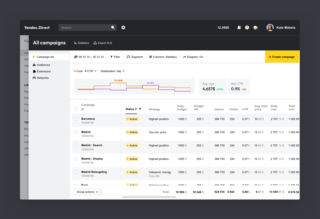
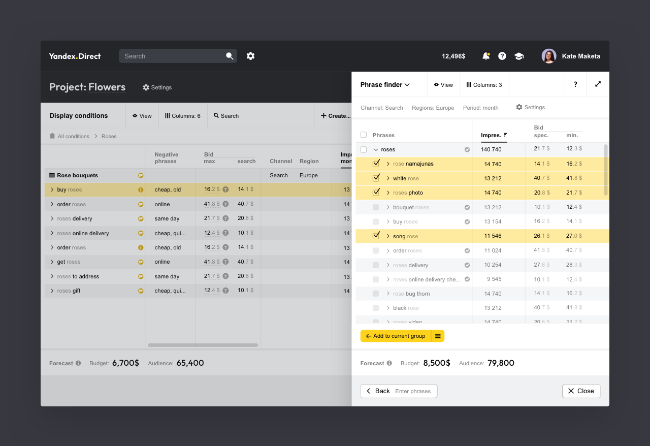
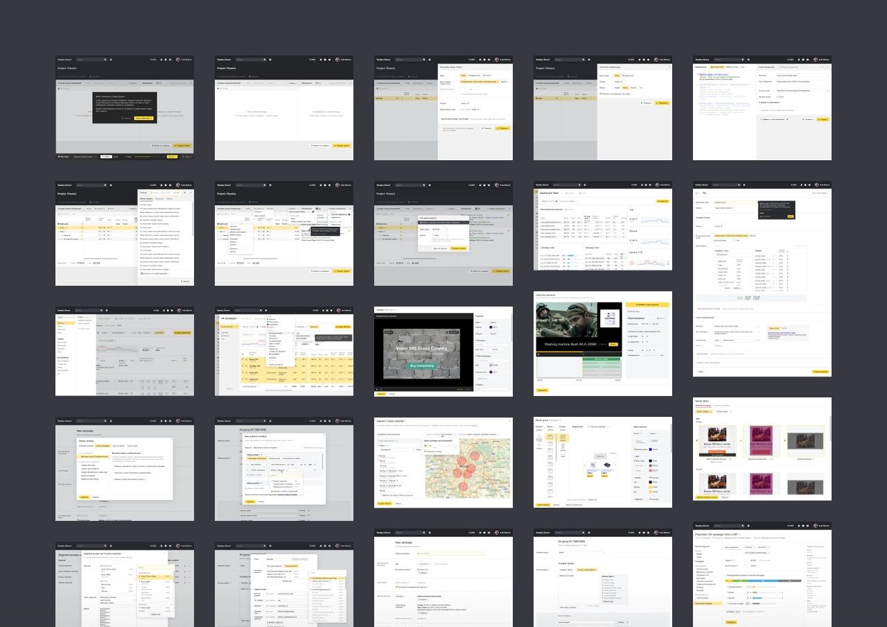
Direct is a web app that most people use to manage their Yandex ads. Based on the research we did with the product team, I made several prototypes completely reimagining the existing outdated design.
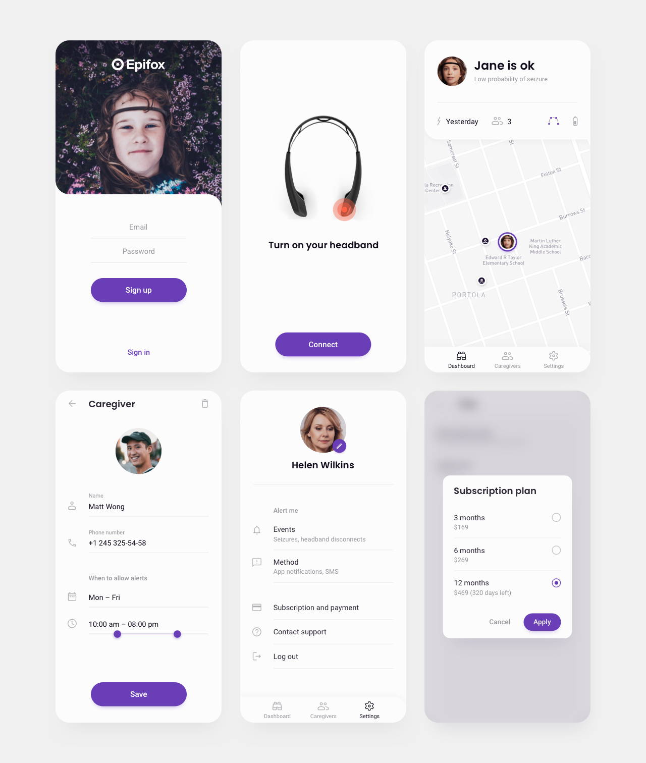
Epifox app.
Epifox is a product for people with epilepsy and their loved ones. The patient wears a brain-monitoring headband that sends a notification to the caregiver app if there’s a risk of an epileptic seizure, allowing caregivers to locate and assist the patient. I researched the field and created a simple prototype of the app. The project didn’t go beyond this stage.
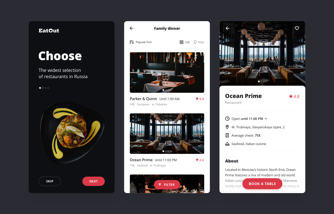
Eatout app.
Eatout is a restaurant booking service. It had an old mobile app that looked outdated, had usability issues, and lacked a number of new features implemented in the web app. I gave it a facelift and patched up the usability holes.
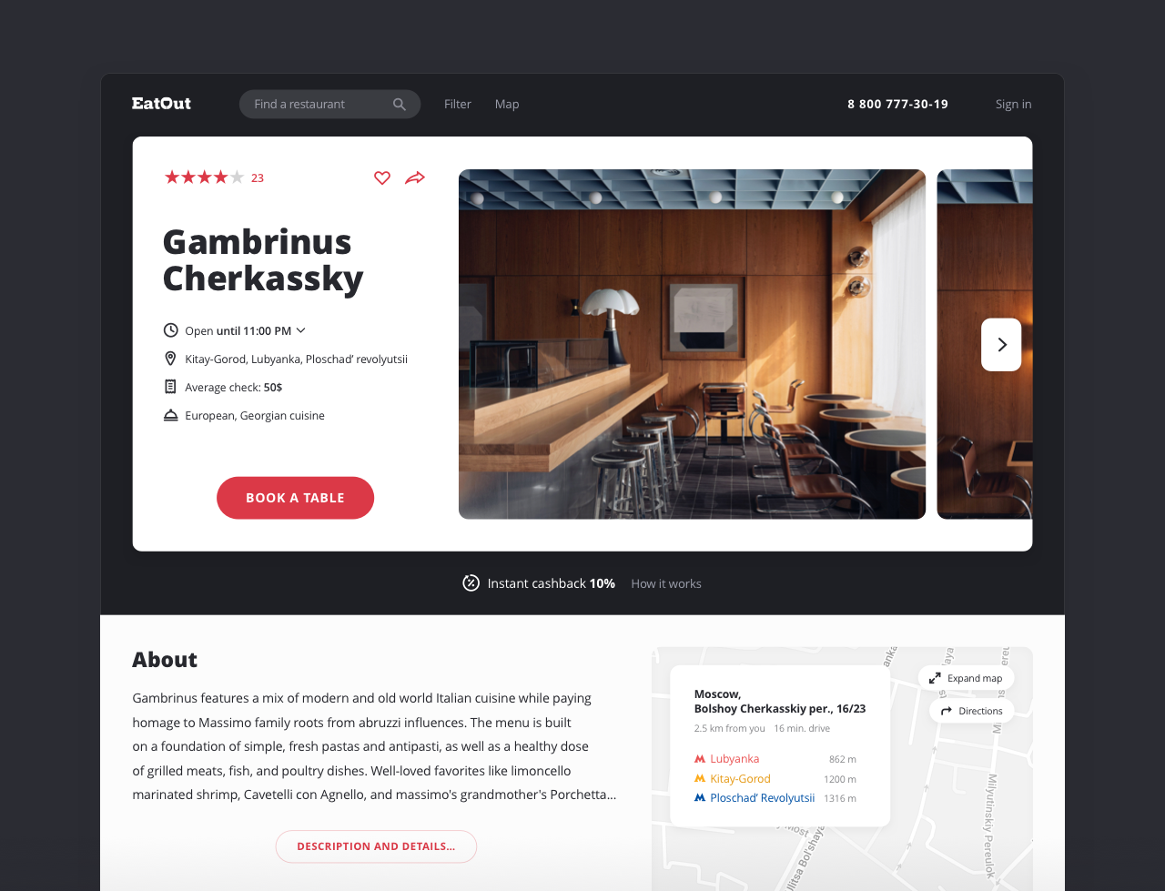
Eatout. Restaurant page.
A redesign of the main landing page where users book tables.
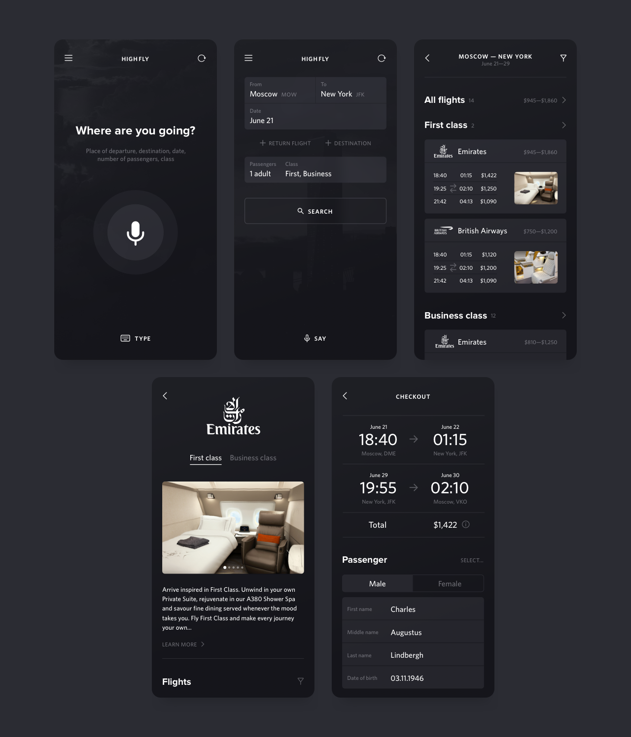
Highfly app.
A concept mobile app for booking high-end plane tickets.
Cerebro app.
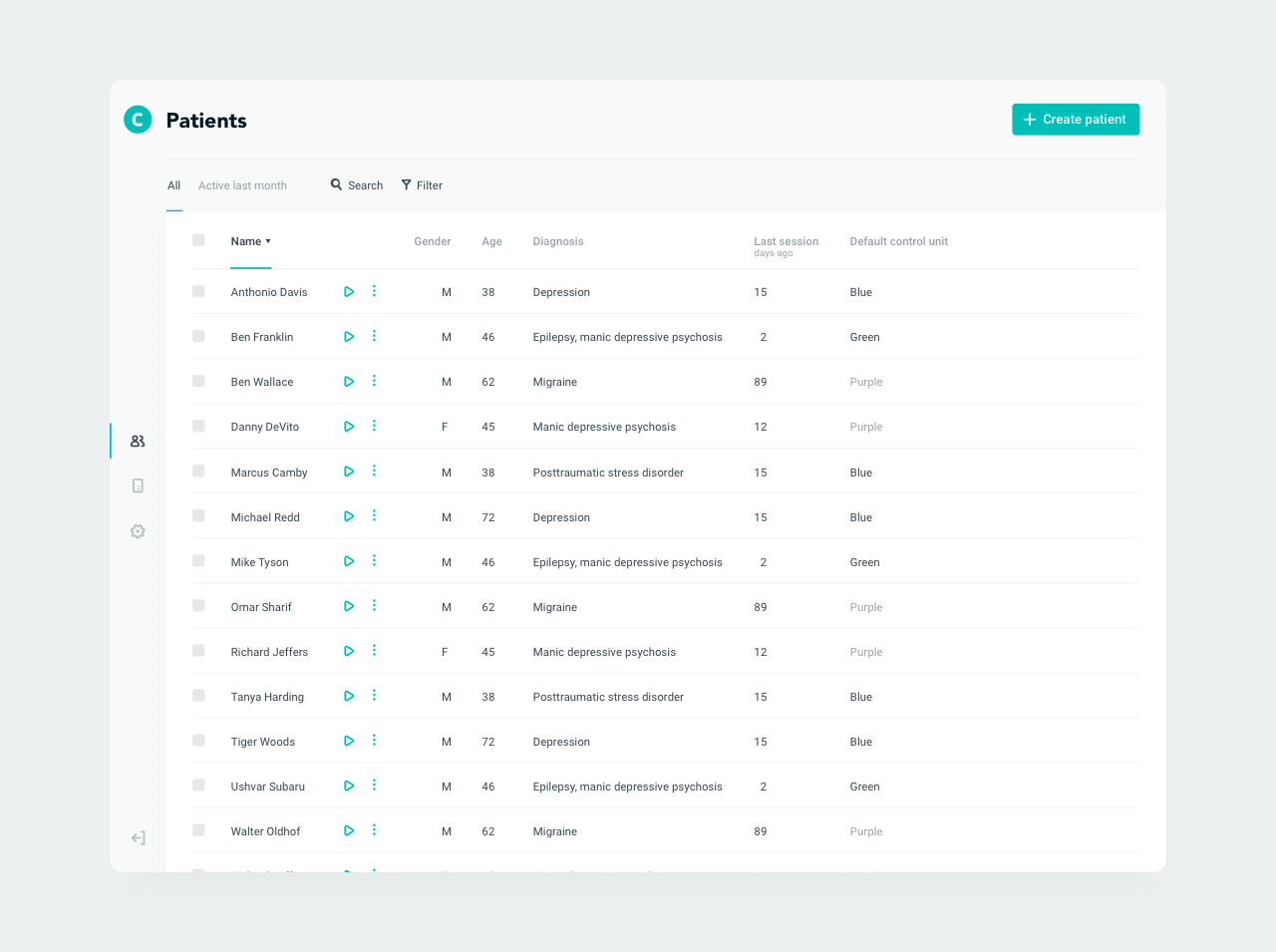
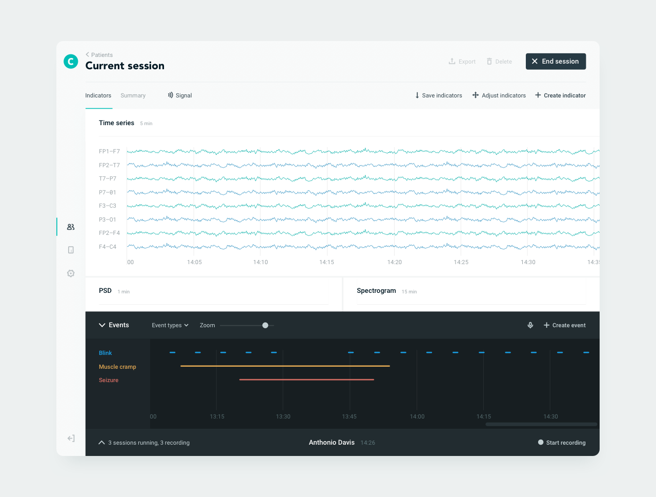
A prototype of a web app for recording and analyzing brain activity via electroencephalography.
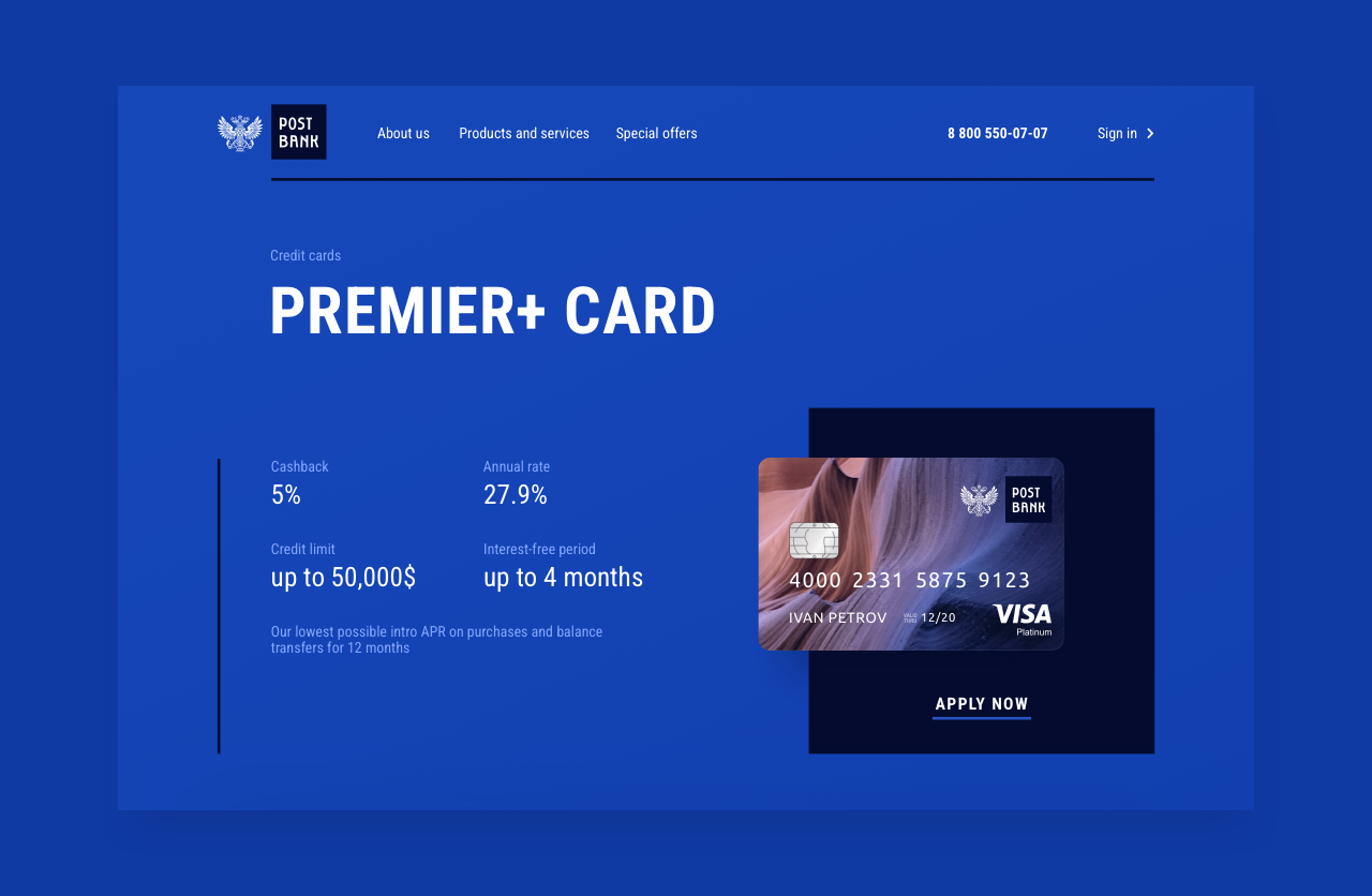
Post Bank. Card page.
A concept landing page for a bank product.
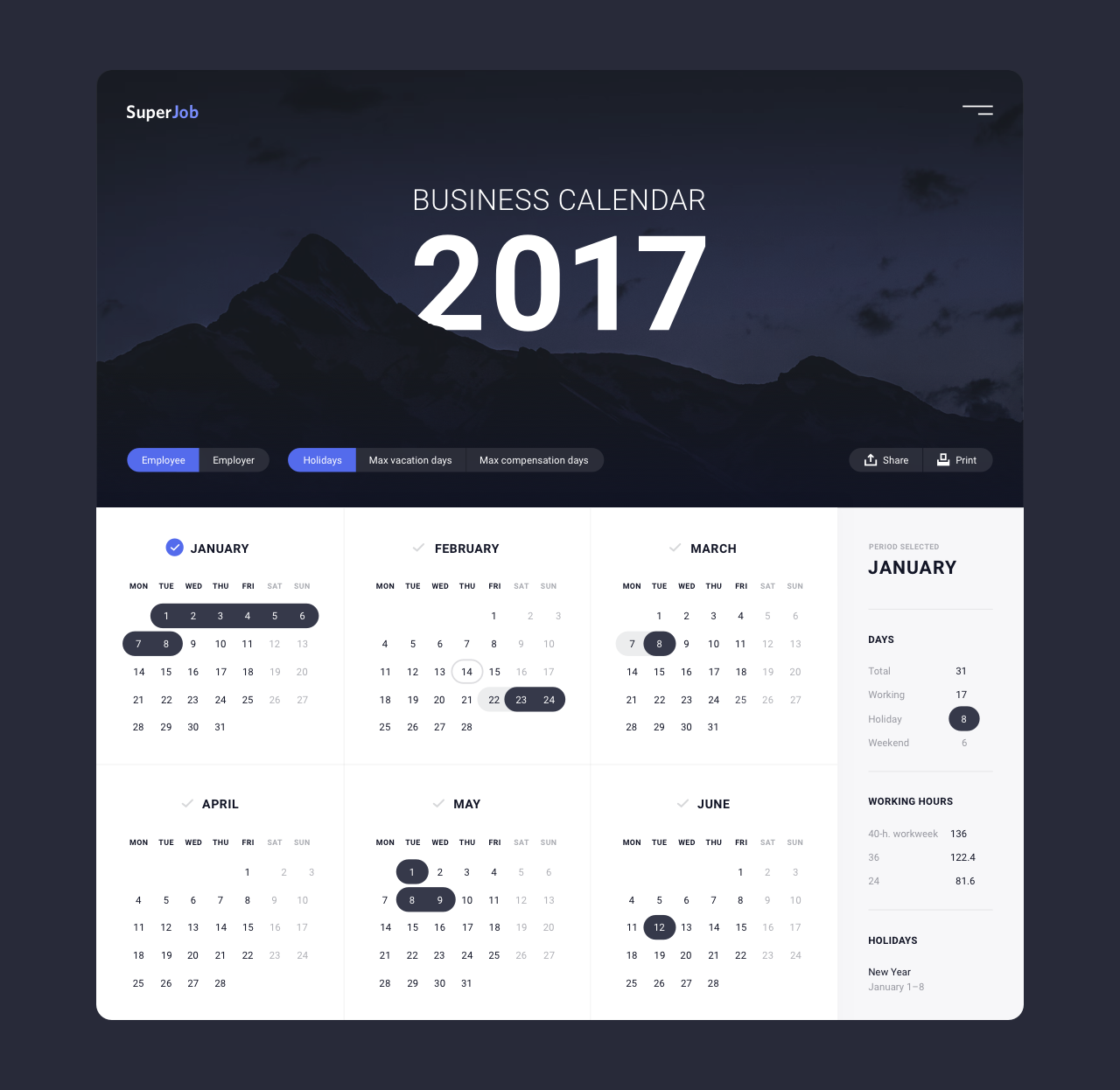
Superjob calendar.
A concept of a web page for employers and employees to check their non-working days and optimal times for taking leave.
